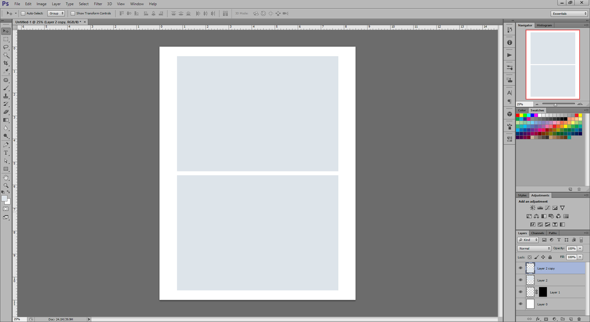
I have been working in Adobe Photoshop for over a decade now, and at some point their default interface changed to a darker gray. It looks cool and goes easier on the eyes, but I realized that it also results in lower contrast in artworks. Whatever one’s editing or drawing seems to have a higher contrast on such a dark gray background. However, if the artwork is viewed against a lighter background, it looks quite bland and pale. I’ve been going back and re-editing images after I was ready to post them, because they just didn’t look good on lighter background. I realized that I need to go back to the neutral gray interface, like it used to be years ago. Keep this in mind if your artworks keep turning out too pale or just don’t look right outside of Photoshop.
To change the interface color go to Edit > Preferences > Interface and pick the desired color.
This is the current default dark interface:
This is the neutral gray interface that I picked now:
Related Posts
Published by TrueNoir
Hi! My name is Oksana Ossipov, and I’m a visual artist and photographer. I was born in Ukraine and currently reside in the area of Dallas, Texas. My formal education includes a BFA in Digital Media Art from San Jose State University. After moving to Texas, I started to focus on my fine art skills and figurative art in particular. I studied for 5 years under Michael Mentler at the Society of Figurative Arts. Through my life, I’ve also acquired a multitude of skills that include web development, sculpting, photography, art studio and business management, and baking awesome blueberry scones!
I’ve been trying to fully devote myself to the art over the past few years. I’m trying to learn and practice as much as I can. However, the workshop, class, and art supply costs present a certain financial challenge. If you like my work and want to support me, I would truly appreciate it! I have a shop full of artworks and creations, but even just sharing my art or social media pages would help a lot. Thank you so much!
View all posts by TrueNoir